Blue
the most human colour
The blue nude has become a symbol of grief and embodiment, but also maybe an emblem for betrayal, consumerism, and the shapes of a body—does it matter if there are clothes and faces?
Over the course of this year, it has perhaps come to mean something more to do with the long shadows of desire. Shadows as beings of absence, perhaps tinged with regret, but mostly a passive longing.
February 11, there are a series of sporadic texts I’ve sent myself:
Some things can only be written in another language.
Blue is the colour of Muizenberg. I left all my blue here
What does this mean but to say that maybe blue is that other colour for which another language is needed. And even then, it’s not really so. This is a short tour through some blue art that will need of you your imagination, especially your suspension of disbelief.
Also, maybe to consider for a moment that perhaps blue is a stand in motif to describe what the beginning of wanting feels like. When you’ve made it to adulthood without a rich inner world of desire, the beginning of want can feel like a grief.
But do not despair. The tap is on. The water is flowing.
The Blue Nudes
We will brush past the sombre and depressing Blue Period (Picasso) in favour of a midcentury series called Blue Nudes by Matisse, the colorist. This series reportedly disturbed Picasso.
“Picasso and Matisse are poles apart aesthetically. Matisse told his students, “One must always search for the desire of the line1, where it wishes to enter, where to die away.” Picasso’s line has no desire; it is sheer will.” — Peter Schjeldahl
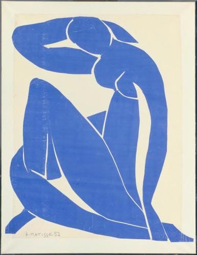
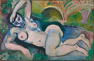
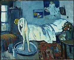
Now, Matisse had been a contemporary of Picasso since the early 1900s — compare perhaps the Fauvist Blue Nude2 to Picasso’s The Blue Room3 for different vibes but similar contents and colours.
What changed? Well, in this nice Singulart Magazine piece, they trace the Matisse history and explain that after his abdominal cancer, he was no longer able to paint and sculpt as he used to do.
Not to read too much into it, but there’s something poignant, like a well aged wine, where the final works of an artist or writer have a distilled quality about them. Drawing with scissors is also a marvellous concept.
Iterations (on Art and Matisse)
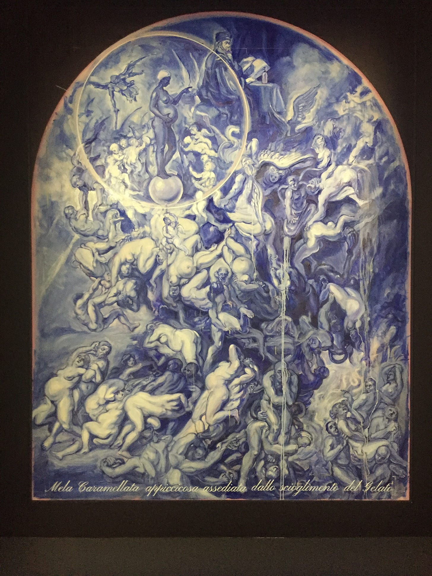
Art thrives on conversation. In fact, you could even think of art movements as an ongoing meta-dialogue. Alluding to or referencing previous work is not essentially derivative in nature, it is part of the tradition and often an indicator of depth and intention. Take for instance the work of Johannes Phokela in Only Sun in the Sky Knows How I Feel — (A Lucid Dream)4. Here is another work in blue, for our theme.
Similarly, there are allusions to Matisse in other words—some directly related to, and other works that could be compared in a formal art critique of a work. Here below are two examples:
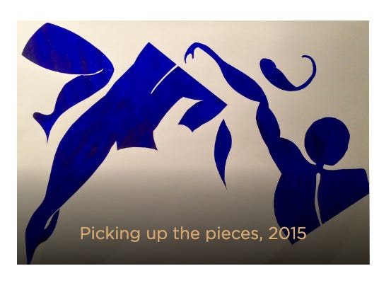
Rachelle Johnson’s Blue World
“The Blue World Series manifests an alternative world free from the categories of race and color that confine us. It envisions a world within which the body can be viewed fully in the light and presence of beauty without preconception.”
This builds upon the theme of body, beauty, and desire (for a world)? While still very much in the artist’s own original style, the figures and the name of the collection don’t exist separate to the centuries of nudes and decades of blue forms.
However, this is an example remarkably different in emotional tone from Picasso’s work. Blue is not sombre and depressing, but in the artist’s words: “uplifting… as it represents the best part of humanity; in a way that an optimist might envision a world that heals from past trauma.”
The subject here is not just the female body, but the black female body. At this point blue is conveying “strength, wisdom, trust, and regality.”
Yes, the blue water from the blue tap that runs through our time is bursting with new light.
The devouring images (blue consumption)
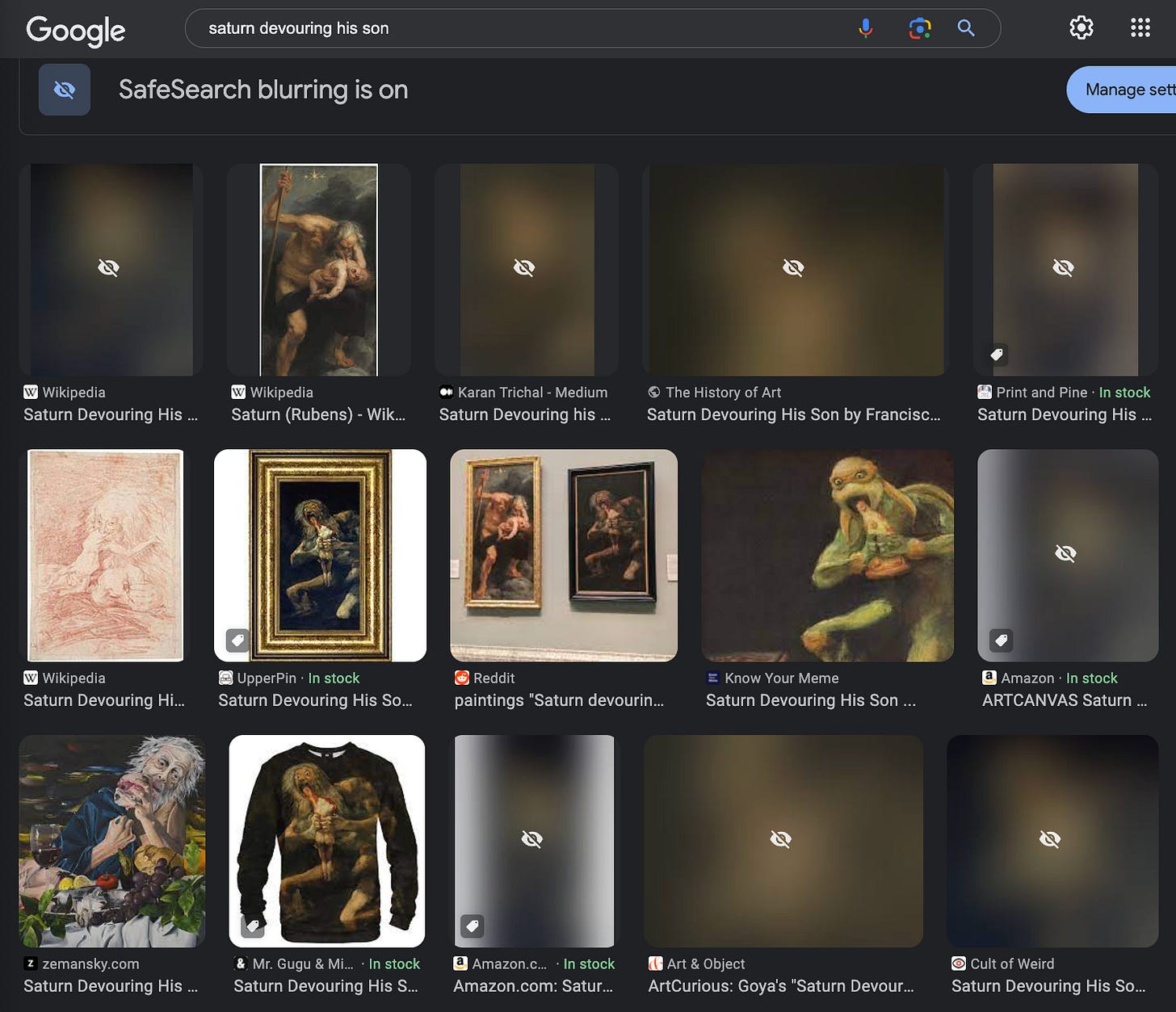
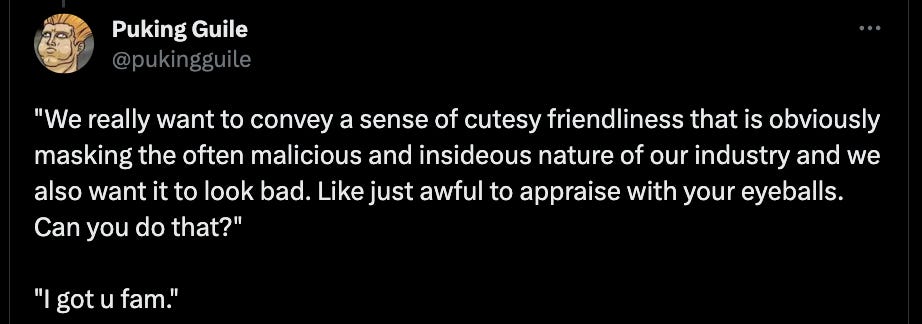
Sticking with the theme of art, there’s that evocative Goya painting—Saturn Devouring His Son5—that’s more than Google Safe Search can handle!6 This isn’t very blue, but thanks to awards for good boys ‘s ever pertinent cultural commentary7, I can across the below image8 — a reference to the Goya painting in the Corporate Memphis, or Alegria, or Globohomo style.
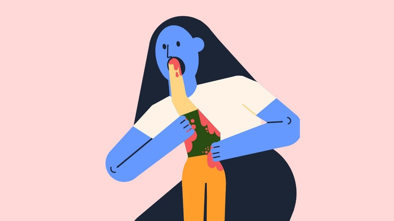
The human figures in Corporate Memphis are aggressively happy, always in motion, and portray an image of harmonious utopia within their illustrations. This bleak, dystopian short film captures the effect by contrasting a bright, happy mural against a backdrop of corporate unhappiness and drudgery.
Like the illustration style that took its name, Memphis was criticized during its time for glorifying conspicuous consumption and being a sign of tasteless consumerism.
Matisse and millennial women
Have you checked TikTok lately?
Have you heard what they’re saying about millennial women and our blobby (Matisse) prints?
No, I don’t have a Public Domain picture I bought as an Etsy Print / from my local organic market above the Ikea-style bookshelf where I keep my copy of The Body Keeps the Score.
But, between my Kew Gardens Botanical Illustration postcards (the non-house owners among us are also in the market for cheap art solutions), and my Desperate Houseplants, I’m a candidate.
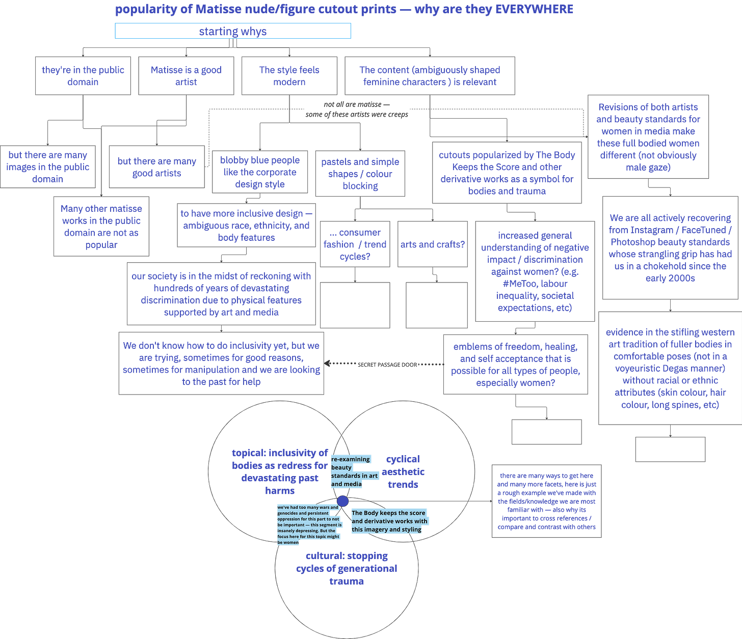
Sure it’s a fad! But it’s not a meaningless one. I attempted a scrupulous and likely incomprehensible attempt at a breakdown of this9, and perhaps there’s something to it?
The Millennial Matisse according to Liz Stinson
In the last few years, this refined cut-out style has been popping up everywhere from shoe brands to Dropbox campaigns to designer dresses. Its garnered artists like Culver thousands of social media followers, who buy prints and commission artwork to hang on their walls and adorn wedding invites.
Not unlike like millennial minimalism, the cut-out aesthetic is beginning to achieve a level of saturation where its ubiquity undermines its beauty.
So why? Maybe because of the 2014 Tate Modern Matisse Cut-Outs exhibition?
The most popular exhibition in Tate’s history, it received over half a million visitors before transferring to Moma in New York… Three years later, in 2017, the Royal Academy hosted another blockbuster Matisse exhibition, Matisse in the Studio, which focused predominantly on the artist’s graphic portraits and colourful still lives.
This piece explores the Matisse popularity:
Wallpaper designer Laura Kavanagh links Matisse’s growing popularity to “the body positivity movement that you see today, and the fact that it has a huge creative community of women surrounding it. We are beginning to embrace the different curves and shapes of the female form and acknowledging these with our art.”
Here we have another link to body positivity! And women.
Maybe because Matisse’s work has entered the Public Domain and is cheap to sell as merch?
As of January 1st 2021, works by Picasso, Marcel Duchamp, Henri Matisse and others are now part of the public domain due to their passing away over 70 years ago. This means that many more pieces of artwork can now be enjoyed by everyone without worrying about potential infringement issues. (source)
But even just in the examples of public domain artists above, surely that’s not enough? This leads me to a potential other reason…
Blue nudes as a symbol for liberation
“The thesis is advanced that the catastrophe in Europe aggravated Matisse’s neurotic conflicts and that his art reflects his effort to resolve these conflicts through new compromise formations and, more significantly, sublimation.”10 — (source)
Matisse’s Blue Nudes have been retrospectively linked to liberation and freedom, but this could have some historical grounding.
[Matisse] regarded [bodies] as the culmination of his artistic life: “Only what I created after the illness constitutes my real self: free, liberated.” The new limitations of his body became an opportunity for renewal. With paint, scissors and paper, he drew, carved and constructed a new self.”11 — (source)
So, perhaps it’s by design, which is also perhaps why it’s become so closely linked to Bessel Van Der Kolk’s most well-known work.
The body keeps the score
Popular discourse has begun to keep score of Van Der Kolk’s influence on our colloquial trauma-creep, or the way that everything can now be reframed as trauma or a trauma response12, even gift giving. Whatever the consensus on this book’s value or Van Der Kolk’s virtues, it’s had a deeply surprising recent resurgence and the ideas of the book have been widely proliferated across all forms of digital media, critical think pieces and extremely online memes alike.13
This zeitgeisty book14 features a Matisse on the cover — though there are 2 different versions, one featuring Matisse’s Icarus, the newer featuring a Blue Nude.
You might also like…
While it’s not ubiquitous, there are enough trauma related, art adjacent blue books with this similar font style to make for a fun exploration15. Some of the authors in the footnote would be considered contemporaries of Van Der Kolk, often appearing in conversation with another.
I’d separate that from potentially derivative works, which seem to be targeted to a similar audience, with similar fonts, images, and words. The two I’ve most strongly associated with the blue body (seeking liberation, grieving, feeling, longing, healing desire, uncovering the hidden parts, digesting pain) are What My Bones Know by Stephanie Foo and The Wisdom of Your Body by Hillary McBride.
We’re not just thinking about content here, but about what has built towards the visual lexicon of the blue body. These aren’t clearly part of the cultural foundation, but maybe these two books are indicators of the association that has been created between trauma healing, the blue nude, and our current time.
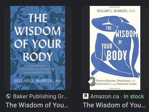
If you’re interested in a recommendation, Dr Dan Siegel and Intraconnected could be a nice starting point.
And what of art?
In conversation with, that’s how it works, right? Art? Matisse? Our bodies and our memory? This theme can find conversation partners not only in books but certainly in art! Here are some of my favourite examples.
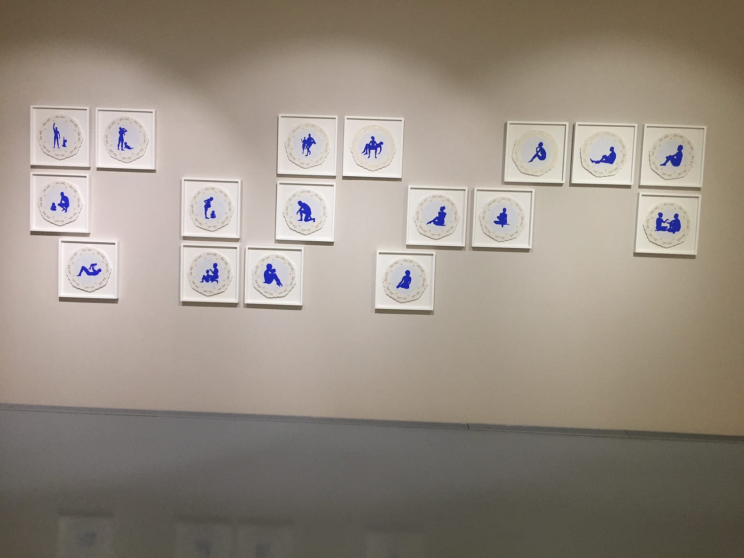
The paper cut figures of a blue Mary Evans
The Zeitz, after Phokela, had a Mary Evans exhibition called Gilt16, which featured a large variety of works, among which we see some blue figures. Evans regularly uses silhouettes as a subject in various colours, but these Willow Plate works caught my eye. Again, there are questions of the form, the figure, the feelings of memory, absence, and perhaps belonging.
In “Vista”, the site-specific work in the Gilt exhibition at Zeitz Mocaa, I wanted to show African bodies at rest and not in fight or flight mode. There are very ordinary poses and very positive poses such as figures practising ballet or generally just in repose. I try to be careful to depict the black body at leisure, which I really shouldn’t have to do but somehow it seems necessary. — (source)
Here is a strange but satisfying tie in the artist’s reflection on the pieces that still speaks to the relationship between the blue body and healing from trauma, the effects of which can at times be marked by the fight or flight mode.
Listen to Mary Evans speak about their work and history here. It’s thoughtful, research-ful, and moving. With comment on the origins of the Willow pattern doilies as linked to belonging and migration.
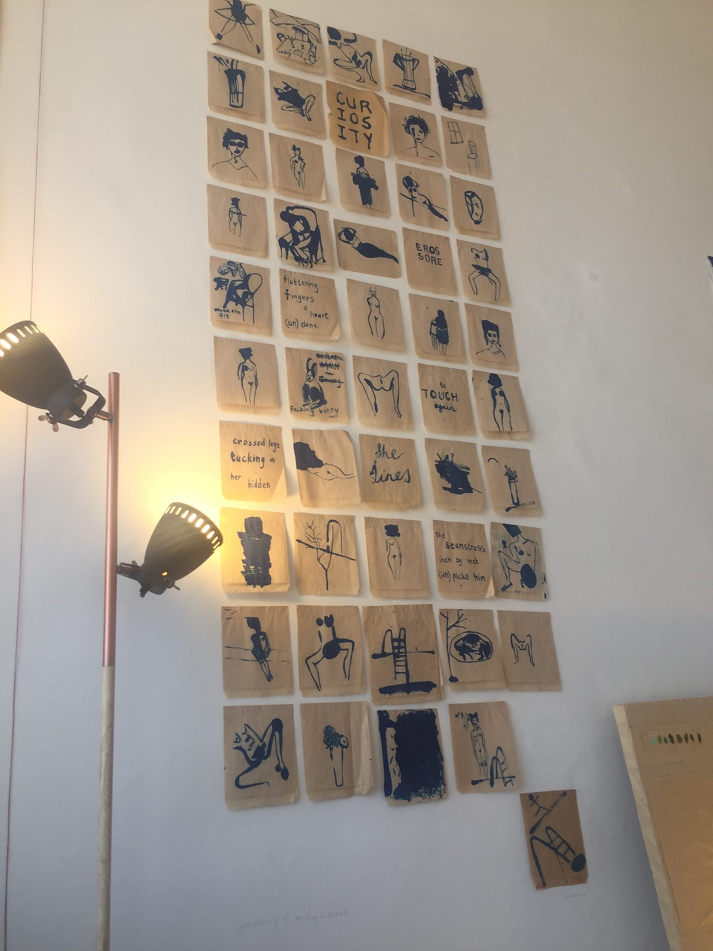
Sue Pam-Grant’s fleeting and blooming sandwich bags
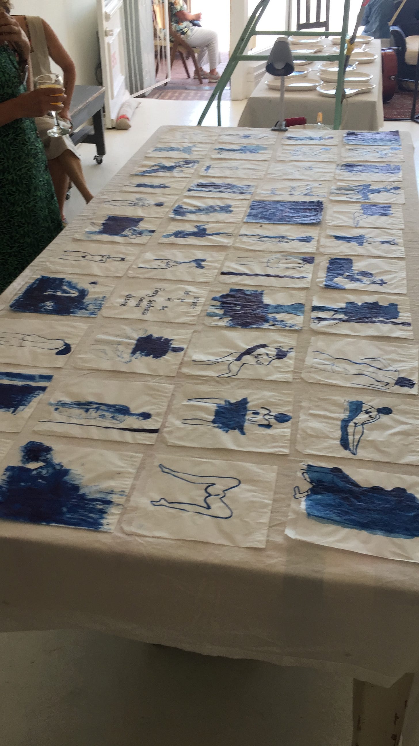
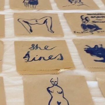
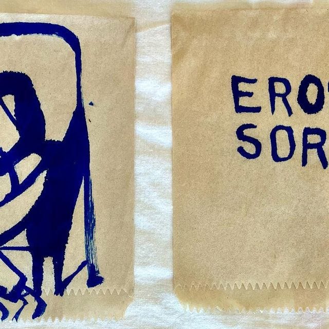
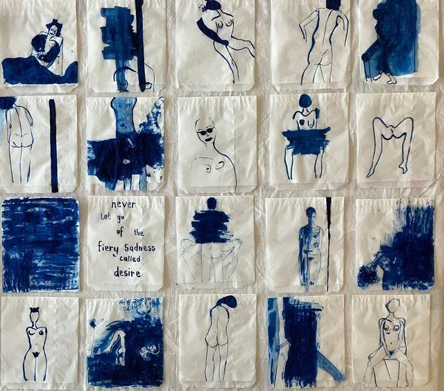
Here we have circled back to the 11th of February, where we began. Now we are in Sue Pam Grant’s studio in Muizenberg at the opening of the Fleeting and the Blooming, an exhibition I snuck into about a week earlier on the way home from a work ending, now made full with a Cello performance.
There’s something remarkably tender about Sue’s work. There’s no public media for this exhibition, titled Conversation 4: “The fleeting & The blooming”, except a few instagram posts17. Even interviews with the artist herself are relatively scarce.
“It expressed what was currently happening. Everything was going. Metaphorically speaking it was a death of a time, it triggered for me huge areas of loss in my life. I could not understand why I was feeling so sad, but on reflection and working through the pieces, I realised this Covid, living in the time of corona, was much more complex than the actual disease. It was triggering a melancholia that was profoundly primal.”
This primal melancholia, this fetching of deep sorrow, unmet longing, and profound sadness is eloquently expressed in this collection of pieces. In other words, if blue is like a language which cannot translate, this work reached the blue parts of me in ways I had not expected.
Part of this Symphony of a Sunday in 50 Parts is a Bāsho quote:
Never let go of the fiery sadness called desire
Remember that tap? To get it to warm, we need to turn it on. I think the blue is the cold water that comes out at first, in order to get the desire tap to the red hot warmth we’re seeking in desire.
Someone should ask Sue about Desire Lines and She-Lines, maybe she should publish a book, maybe you could just DM her on Instagram, and maybe there will never be an exact and discrete answer, it’s more this knowing that has emerged after time spent.
Blue Lips, Blue Veins, Blue the color of our planet from far, far away
Lastly, I’ll leave you with this piece that’s been going in my head for this whole piece. I’ve been fascinated with Regina Spektor’s idea of blue being the most human colour—I would’ve thought it to be red or something. But maybe, to be human is to have this inherent sense of tragedy and inevitability.
We have the ability to plan and dream into the future, and to ignore the very plans and warnings we have set for ourselves. We have the capacity for empathy and foresight, but we still make short term decisions that have destroyed many futures. We can see the effects of our actions and destruction, and yet let the discomfort and pain be shrouded by suspension of feeling, the simulation. We’ve done so much to reckon with what freedom means, only for us to spend significant portions of our lives in meaningless work that sometimes makes life worse for us all.
They started off beneath the knowledge tree
And they chopped it down to make white picket fences
And they're marching along the railroad tracks
They smiled real wide for the camera lens
As they made it past the enemy line
Just to become enslaved in the assembly lines
Humans as beings of longing, of hubris, of dissociation, and of ancient tragedy.
Endings
In the following day’s texts, perhaps I had more words.
Not cohesive thoughts, but in a blue-ish language, this is the most I have for now, and it has fed me well these last 7 months in a series of deeply unexpected highs and lows that have brought me back to that question of what it means to be human. As tragic and hopeful as Regina’s song.
The human things are the dying things (as Greta reminds us).
It is ended as follows18 (and what does it mean? everything and nothing, of course, it’s just the fleeting impressions and ideas I sent to myself, while trying to find the words, and a way out)
Sorrow is the stuff of art.
Darkness is everlasting? The night came before everything else. It’s light that’s ephemeral. What light is there that doesn’t come from energy burning?
And so to create is to learn to sit in that darkness the quiet darkness of self, the inferiority.
The silence that holds everything
The stillness which is also the birthing place
A tolerance for absence
And then something.
Something starts moving. Before you know what it is. It begins
The erotic is the stem?
Why does art need sadness? It’s the hollow and we carve it out even more to be filled. Sorrow is the woven net to hold the eggs of joy?
The Desire of the Line!!!! The desire of the line. We will return to this! It is important. It’s part of the expression of longing. I don’t mean to be too hermeneutic here, but this is a core theme we will need for later.
Here’s an interesting comment about this era of paintings if you wanted to read more.
A note on Phokela’s “Original Sin”, a decades long conversation with Rubens’s Fall of the Damned — images can be seen here.
“But academic naturalism is not his ambition; rather it is the production of a dialogic and iconoclastic form of figure painting that directly and emblematically, with baroque flourish, speaks to our querulous present.” — Sean O’Toole
and apparently, yes! the exhibition title is a reference to Nina Simone’s Feeling Good — another desirous, tender, melancholy song filled with plausible yearning.
I need to know, is this Hozier song related to Saturn Eating His Son?
This is one of the Substack posts I think about the most, I’ve read it too many times. It’s just so good. it’s such an immaculately curated collection of things that sit on the line between astute cultural commentary and delightful nonsense.
Possible Sources:
“In conclusion, the Globohomo art style may have its roots in the influence of minimalist design in the tech industry. However, its pervasive presence in modern advertising has been met with criticism from both critics and consumers alike.” — Carson Gray Hall
All the sources on the reverse image search are all criticisms of the art style. Is this image the symbol or totem of the criticism? This piece discusses the increasing homogenisation and flattening of brand identities. Did Buck start the trend?
This piece is by far the strongest narrative on the origin of this style. Best guess at origin is @clayohr. In agreement with the above, the piece dissects how the style “makes big tech companies look friendly, approachable, and concerned with human-level interaction and community – which is largely the opposite of what they really are.” — note here the dissonance and disconnect.
On why Corporate Memphis is everywhere, and its fake representations of utopia:
Corporate Memphis’ geometric forms, along with its highly contrasted and bold color style are similar to that of Memphis furniture designs. Additionally, the way figures are warped in Corporate Memphis is reminiscent of how Memphis designers depict everyday objects in unusual way
Full Quote:
A recent exhibition at the Museum of Modern Art, “Matisse: Radical Invention 1913–1917,” focused on a breakthrough in Matisse’s art that the curators attribute to the impact of World War I. That this dramatic change may be linked to the trauma of war is explored by studying the art itself, biographical material, and the artist’s own insightful comments. The thesis is advanced that the catastrophe in Europe aggravated Matisse’s neurotic conflicts and that his art reflects his effort to resolve these conflicts through new compromise formations and, more significantly, sublimation. Sublimation is discussed as it relates not only to the “radical invention” of Matisse’s wartime art but also to a concurrent transformation of his personality. These ideas about Matisse are applied to clinical vignettes in a consideration of the role of sublimation in a contemporary view of therapeutic change.
— Sumblimation and the sublime, a conversation for another day.
Full Quote:
As a professor of philosophy exploring important life questions with my students — most of them young people whose conception of the world is more likely to be shaped by social media and corporate messaging than by the occasional course in philosophy — this is one I return to often: How can we come to understand the full range of the body’s aesthetic potential and power?
I like to tell them about Henri Matisse.
He regarded them as the culmination of his artistic life: “Only what I created after the illness constitutes my real self: free, liberated.” The new limitations of his body became an opportunity for renewal. With paint, scissors and paper, he drew, carved and constructed a new self.
There is a lesson here about what it means to care for the body, to inhabit the bodies we have not merely with acceptance and love, as we are often rightly advised to do. It is a lesson learned when we live through our bodies as vehicles of beauty, as conduits to aesthetic engagement. It is a lesson learned when we practice a radical aesthetic openness to our bodies, to what they can do and produce as time and chance inevitably transform us.
Notes on the Tell Me Why It Hurts piece:
to be honest, unless there are references, models, theories, operationalisations and clear definitions stated, I generally just gloss over trauma claims and assume the intended meaning is: a disconnect, often between feeling and affirmed reality—which can be very severe or mild, no need to gatekeep the experience of deep confusion! Surely there’s a name for the phenomenon where a specific academic term is popularised in culture to the point where they mean different things when said by the academic vs the average person. Concept creep?
When that disconnect, severance, and dissonance is large enough and/or for a prolonged enough time it can become damaging or more remarkably harmful. When that harm is experienced without sufficient community support post injury, it can lead to prolonged problems and disconnect — i.e. Post Traumatic Stress Disorder(s).
(This is how I've heard the small-t trauma described by Thomas Hübl, whose annual Collective Trauma Summit I’ve been attending, rather than how it is in the article)
Diagnosis is a separate debate, two interesting pieces here and here.
Yes, I have turned a paragraph into a garden of media. Go exploring if you like. Broaden your tab horizons.
Book summary video by School of Life:
You might like these other blue books:
Know My Name — Chanel Miller (Brilliant book! Also about trauma, and art, which features similar font? Greenish blue?)
The Island of Missing Trees — Elif Shafak (Also blue with curvy lines, big trauma stories, really interesting book with heart wrenching vignettes)
What Happened to You — Bruce Perry & Oprah Winfrey (also blue green figure, well refined telling of trauma and effects of adverse childhood experiences)
Intraconnected — Dan Siegel (a bit of a departure, but if we consider that connection and integration is what healing trauma looks like, then Siegel, a respected voice in the trauma crowds, is right on schedule with blues!)
Any book by Stephen Porges (every polyvagal book is blue?! They all have those neuron-like images on them, kind of like the sparkly stars in the original Van Der Kolk Cover)
Healing Trauma: Restoring the Wisdom of Your Body — Peter Levine (another well-known trauma person, with a blue book and figure of a woman with many parts. Please also note the title that is similar to modern versions.)
Dick Schwartz doesn’t have blue books, but the one with Alanis Morisette does have some squiqqly art on it.
some screenshots from suggested books beneath The Body Keeps the Score:
The focus is on memories and she agrees that an important aspect of her work is about changing materials that are mundane into something meaningful. It is about making the unseen visible. Using cheap material is also predicated by the fact that the Black body was treated cheaply. The bitter sweet comes through in her poignant imagery. — (source)
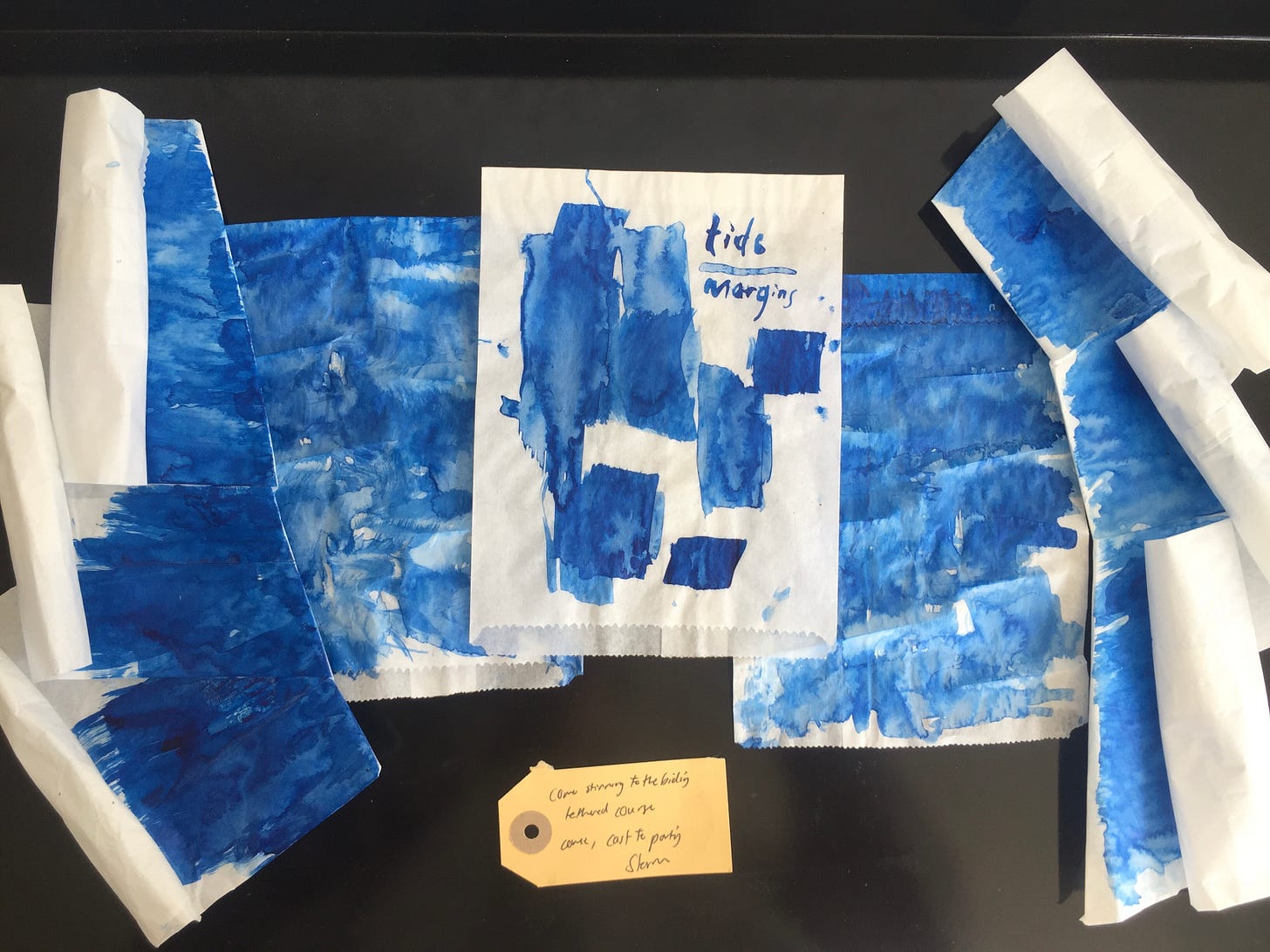
in truth, there is no ending. And perhaps a pertinent ending to this blue opening that ends in the very blue air of Muizenberg is this collection of sandwich bags that came from a night at Sue’s workshop that I attended in March amidst a time of tremendous grief.
There are endless recapitulations, it just depends on your time scale. I’ve had my own history in Muizenberg, and it’s always accompanied times of great changes.


